Dramatic Granola: Identity + Packaging + UX/UI
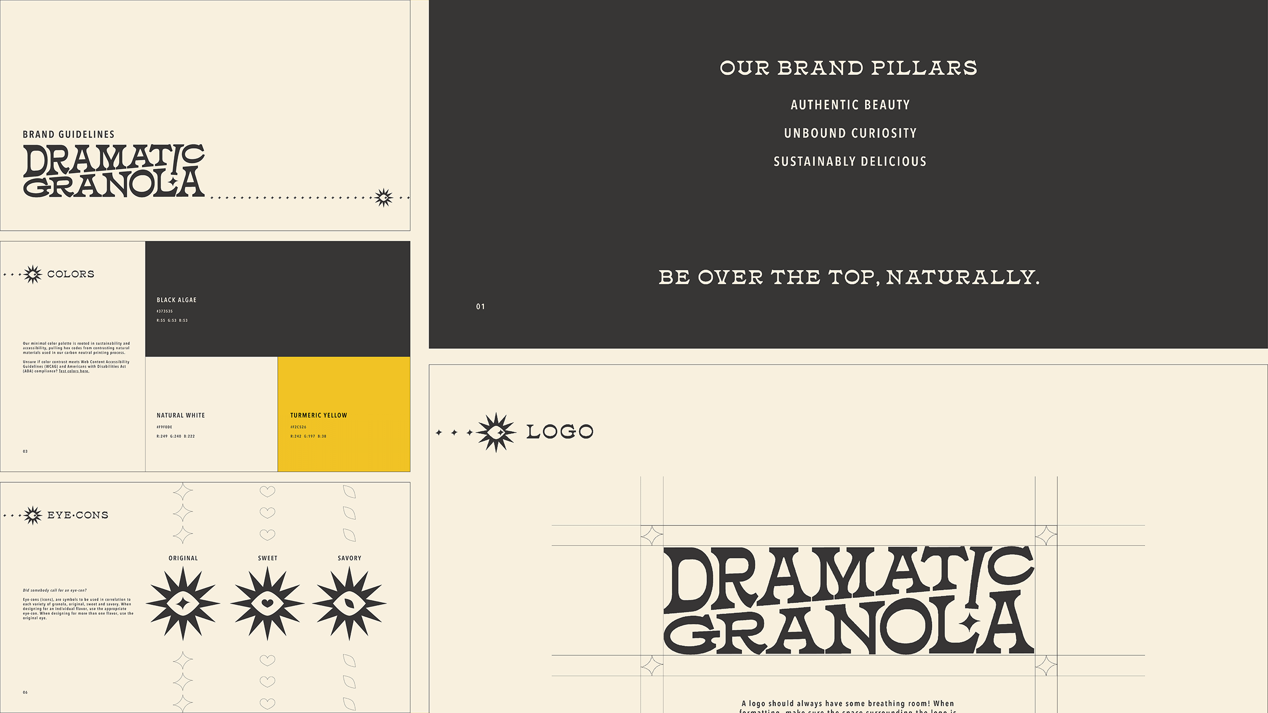
This brand makes morsels for a flamboyantly crunchy clientele who value authentic beauty, unbound exploration and high quality snacks. Naturally over the top, Dramatic Granola blends excessive ingredient combinations with strong sustainability practices.
Packaging is designed for black algae offset ink on kraft containers and uses vibrating patterns instead of bright colors to draw in consumers and stand out against competitors. Knowing the playfulness of its’ target audience, the brand utilizes an eye-rolling icon to capture the understood too-much-ness of the product, and uses varying shapes to differentiate flavors.


